

If you feel like changing your blog’s social sharing widget then you’re in luck. Today’s featured tutorial involves a new and refreshing social sharing widget design courtesy of Abu Shaleh.
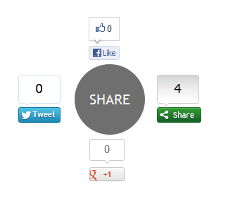
The widget appears as a simple grey circle with the word ‘Share’ written inside it but once you hover your mouse cursor over it, four share buttons appear spinning and zooming out of it: a Facebook ‘Like’ button, a Google +1 button, a Tweet button and a ShareThis button.
Check out the live demo.
Here’s how you can install it to your blog:
- In your Blogger dashboard, go to Design and then click on Edit HTML.
- Check the Expand Template widgets box.
- Search for the following tag or line of code by pressing Ctrl+F.
<div class=’post-footer-line post-footer-line-1’>
- Copy/paste this CSS/JavaScript code immediately right after/below it:
<b:if cond='data:blog.pageType == "item"'> <style type="text/css"> .ringMenu { width: 100px; margin: 150px auto; } .ringMenu ul { list-style: none; position: relative; width: 100px; color: white; } .ringMenu ul a { color: white; } .ringMenu ul li { -webkit-transition: all 0.3s ease-in-out; -moz-transition: all 0.3s ease-in-out; -o-transition: all 0.3s ease-in-out; -ms-transition: all 0.3s ease-in-out; transition: all 0.3s ease-in-out; } .ringMenu ul li a { display: block; width: 100px; height: 100px; background: rgba(50,50,50,0.7); text-align: center; line-height: 100px; -webkit-border-radius: 50px; border-radius: 50px; font-size: 20px; } .ringMenu ul li a:hover { background: rgba(230,150,20,0.7); text-decoration: none; } .ringMenu ul li:not(.main) { -webkit-transform: rotate(-180deg) scale(0); -moz-transform: rotate(-180deg) scale(0); -o-transform: rotate(-180deg) scale(0); transform: rotate(-180deg) scale(0); opacity: 0; } .ringMenu:hover ul li { -webkit-transform: rotate(0) scale(1); -moz-transform: rotate(0) scale(1); -o-transform: rotate(0) scale(1); transform: rotate(0) scale(1); opacity: 1; } .ringMenu ul li.top { -webkit-transform-origin: 50% 152px; -moz-transform-origin: 50% 152px; -o-transform-origin: 50% 152px; transform-origin: 50% 152px; position: absolute; top: -70px; left: 50px; } .ringMenu ul li.bottom { -webkit-transform-origin: 50% -52px; -moz-transform-origin: 50% -52px; -o-transform-origin: 50% -52px; transform-origin: 50% -52px; position: absolute; bottom: -70px; left: 50px; } .ringMenu ul li.right { -webkit-transform-origin: -52px 50%; -moz-transform-origin: -52px 50%; -o-transform-origin: -52px 50%; transform-origin: -52px 50%; position: absolute; top: 10px; right: -50px; } .ringMenu ul li.left { -webkit-transform-origin: 152px 50%; -moz-transform-origin: 152px 50%; -o-transform-origin: 152px 50%; transform-origin: 152px 50%; position: absolute; top: 10px; left: -50px; } </style> <div> <script type="text/javascript">var switchTo5x=false;</script> <script type="text/javascript" src="http://w.sharethis.com/button/buttons.js"></script> <script type="text/javascript">stLight.options({publisher: "ur-e9856caa-8f3b-40a6-82af-461e390fe167"});</script> <ul> <li><a href="#main">SHARE</a></li> <li><span class='st_fblike_vcount' displayText='Like'></span></li> <li><span class='st_sharethis_vcount' displayText='Share'></span></li> <li><span class='st_plusone_vcount' displayText='+1'></span></li> <li><span class='st_twitter_vcount' displayText='Tweet'></span></li> </ul> </div> </b:if>
- Save your template and that’s it. You’re done!
Lorem ipsum dolor sit amet, consectetur adipisicing elit, sed do eiusmod tempor incididunt ut labore et dolore magna aliqua. Ut enim ad minim veniam, quis nostrud exercitation.


0 comments:
Post a Comment